Off-Season Artists: Michael Dumas
It’s that time again! Here’s Off-Season Artists, where Alex, intrepid interlocutor of the internet, interrogates some of Canada’s most interesting artists. This edition features Michael Dumas, a realist painter who imbues his canvasses with a sense of elevation and nostalgia that reach beyond simple representation.
Enjoy!
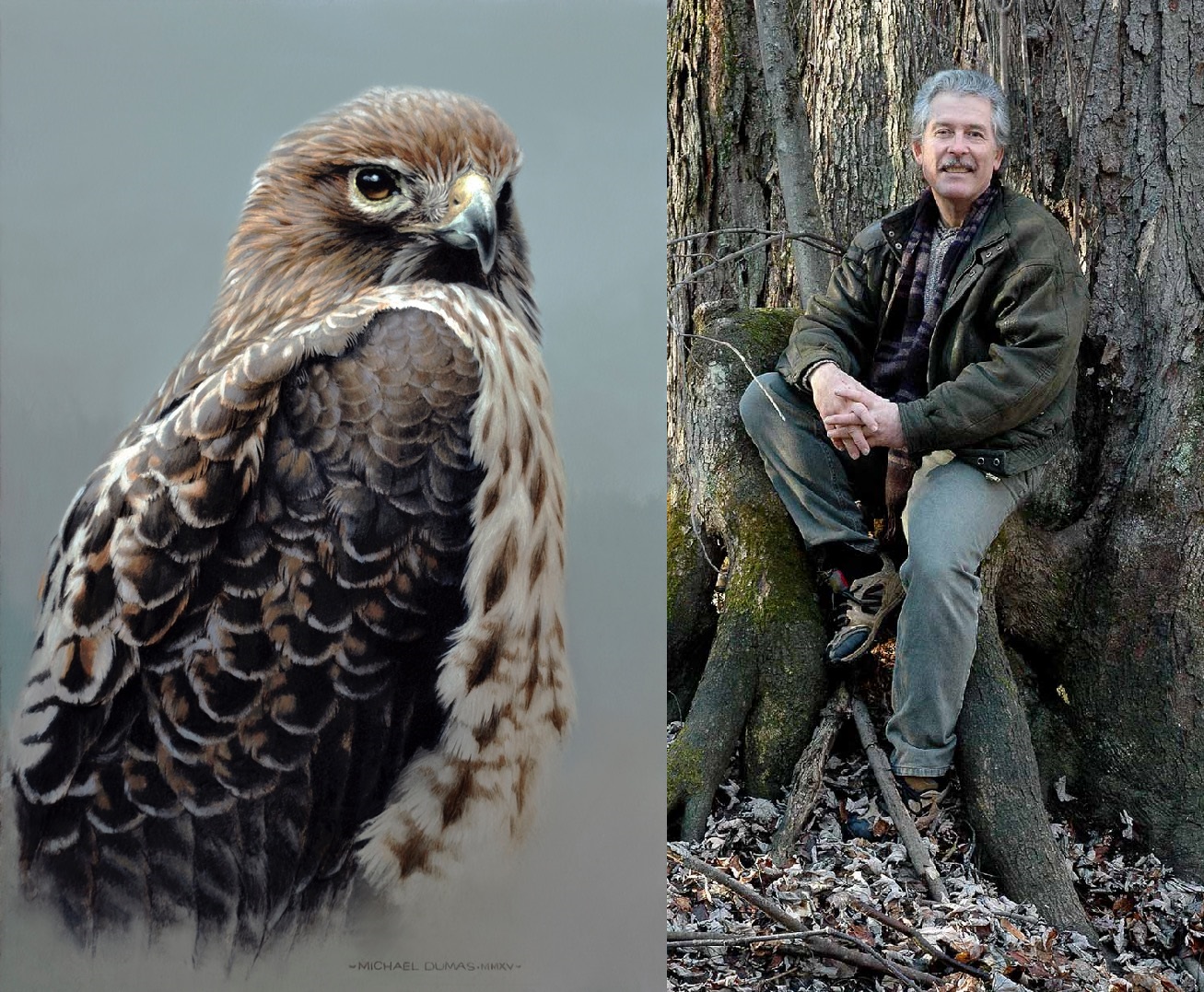 “Watchful,” depicting a red-tailed hawk alongside its creator, Michael Dumas
It’s a pleasure speaking with you, Michael! You’ve had a long career in the arts and naturalism, starting with where you grew up, right outside of Algonquin Park in Whitney. You even spent time as a ranger! I’d love to hear a little bit about your experiences in the bush and how that contributed to who you are.
I guess everyone is influenced by where they grew up, and Algonquin is part of my very earliest memories. We would often take Sunday drives in the park when I was very young, and that was when there was a lot of deer in the park. I remember feeding the deer by hand, just like in those early postcards from the late 1950s and early ’60s. When I was a bit older, I had the opportunity of exploring a few of the hiking trails, and I spent a lot of time in the bush on the outskirts of the park. Being a ranger was an extension of all that, and something that I took to quite naturally.
Among the things that have stayed with me from all this is a vivid sense of nature as something dynamic, changing from moment to moment. When you’re in the bush day and night, every day for weeks at a time, you become intensely aware of weather, the wind and the rain, the passing of the sun, wildlife, whether you can find dry firewood, and so on. You become sensitized and very observant of the world around you, and it is a mix of both pleasure and hardship. Even a simple thing like having really cold water to drink is something very rare in the bush, and if you come across a spring on a hot, humid, summer day, it’s like striking gold. This combination of hardship, awareness, and moments of comfort and natural beauty, really does have a lasting influence. If you’re an artist, it’s bound to influence your work.
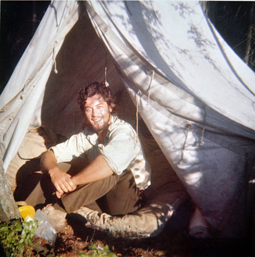 Michael in 1970, his ranger days
I notice that your education is a blend of art and ornithology. Which would you say was your first love, being a naturalist or being an artist? How do the two occupations come together in your art?
Experiencing nature has been instrumental to my art, but my art is first and foremost an expression of self, and that comes first. I do more work involving birds than any other single subject, and maybe it has something to do with childhood experiences. We always had winter bird feeders, and I also have some very early memories of being shown nests with eggs and baby birds in them. My mother used to put out short pieces of yarn and twine on a cedar in the front yard for the cedar waxwings to put in their nests. Swallows would nest high up under the eaves of the stable and my grandfather’s workshop. Seeing birds was an everyday event, and I never tired of watching them.
When I was maybe seven or eight years old, a bird had flown into the kitchen window right behind where I was sitting. By the time I ran out to see what it was the bird was already dead. It was a sparrow, and I remember picking it up and being fascinated by the colours and markings of its feathers. Of course, I’d seen sparrows before, but not up close, literally right in my hands. I hated the idea of just tossing such a beautiful thing away, and that was probably my first attempt at holding on to something by drawing it. This all just came about without any planning on my part, just me following a natural inclination of the moment. And, I suppose that’s pretty much at the heart of both what I do, draw, and paint, and what my subjects are: things that draw my attention. And if the interest is strong enough it winds up being expressed in either a drawing or painting, often both.
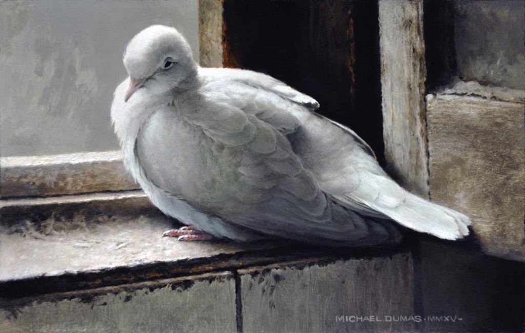 “Recumbent Grace”
Speaking of your favourite natural subjects, starting in the late 70s you really launched into conservation efforts. Now you’re known as a force in Canadian conservation. What prompted that initiative that’s had such a profound effect on your life and your art?
I think my involvement in conservation efforts is a very natural one. People care and protect the things they love. I am aware of the many objective reasons for conservation and preservation, and they are all good, solid, and sound. In the end though, it’s the emotional aspect of it all that really has the final say, and it’s the underlying reason so much of my time over the years has been devoted to it.
Now in terms of your artistic style, what guided you towards realism?
I draw and paint in response to either a direct experience or a concept that comes to mind, and my thoughts relating to both are always in the form of realistic images. I think the reason for this is simply because there is not a moment of our waking lives that is not directly connected to imagery of real things. When we read or listen to a story, when we think of family and friends, places we’ve been, and any memory we might have, it is realistic images that form in our minds. Even our subconscious, such as when we dream, is in the form of realistic images regardless of the emotional content of those dreams.
So in this sense, realism is the fundamental experience of life, and because of this, it is also a universal means of communication. I certainly want my work to be relatable, to communicate with the viewer. But real life experience is always subject to a high degree of interpretation because of our individual preferences, biases, and so on. This is what makes realism in art quite different than, say, the realism found in a photograph. The artist working by hand has a very different—andI would argue a much wider—range of purely subjective choices at every turn of the process. The end results are also influenced by the unconscious individual ‘touch,’ much like one’s signature.
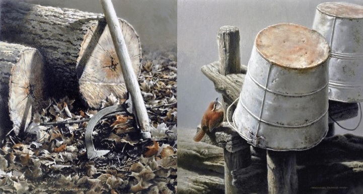 “Hardwood Down” and “Stable Mates”
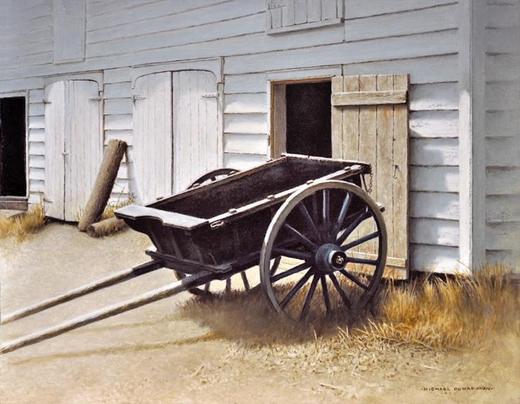
I have to admit I just love the paintings that focus on chopped wood or rustic tools, with small wildlife perched and hanging out around them. There’s something so charming, and the textures are perfect for your style. Where did the inspiration for that series come from?
Well, all these things I’ve been saying can be applied to subjects dealing with man-made objects. I’m painting what I know, things imbued with meaning to me personally. All of these objects I’ve included in a painting are familiar because I’ve actually used them, or has been directly observed being used. I know what it feels like to heft an axe, walk into the coolness of a stone mill on a hot day, or feel the silvery patina on the handle of a well-used implement. The wildlife that finds its way into my paintings is just exactly those species that you see in that environment. The sparrows that appear so frequently in these paintings are not generic representations of the species, but individual birds I have come to know over time. It’s all very personal.
 “Down Time”
Within the realm of realism, I notice a preference for muted tones: russets, muted golds, pale light… something almost like soft stage-lighting. What attracts you to that aesthetic?
It comes from being selective in the use of the various things that make up a painting. This applies to colour, but also to manipulating edges or adjusting tonal ranges, or detail emphasized in key areas but subdued or eliminated in others. Being selective is part of the process at every stage, even to precisely locating the various elements within the painting’s borders, adjusting the proportions of the painting itself, and so on.
But getting back to colour and how it directs the variety and range of colours used. It has a lot to do with light, and the purpose light serves in a work. Light can be considered like the French Impressionists did, where all the colours in the prism are contained in white light. And if you work from that premise it is a natural path to emphasizing the colour spectrum and making it a primary feature. On the other hand, you can view light first as a means of illumination. In this case, the effect is to reveal three-dimensional structure and how the patterns of light and dark contribute to revealing shape, depth, and surface texture. Selectively manipulating all of this in just the right way can lead to a heightened dimensional effect. So it’s a matter of emphasis. The first premise emphasizes colour first, and the second premise emphasizes form. That’s not to say the emphasis on one eliminates the other, but it does tend to sort out which is primary and foundational, and which plays a supportive role.
Your question clearly indicates which approach I am inclined to work within, but maybe I haven’t really addressed why I am attracted to that aesthetic. I think there are a couple of reasons, the first being that all of my work is based on drawing, and drawing is essentially the description of form and as such it doesn’t require colour. I don’t separate my drawings from my paintings, so paintings become extensions of the drawing process rather than something entirely different. In the vast majority of my work, colour is a means to support and enhance the drawing element, not the other way around. Couple this with my preference in subject matter and exercising restraint by being selective and you get the general approach of my work.
Oh, but one more thing about colour and subject matter. If I choose a very colourful subject, the colour is there in the painting too, but not at the expense of reducing form. Something very colourful, such as a peacock, will still be treated with a version of light as illumination. In fact, I have done that in a painting called “Indigo and Umber,” and even though colour is a primary feature it does not reduce the importance of form. It is also a good example of how my work can be said to be realistic, but it is a realism greatly filtered through very personal preferences and emotional responses.
 “December Twilight”
What an amazing chat with Michael! I just loved hearing him speak about his ideas concerning the use of colour and light…
I can’t wait to interview our next artist, so stay tuned and we’ll be back soon with David Grieve!


